
A Web Application
Farmers Event Management
UI/UX Case Study
PROJECT OVERVIEW
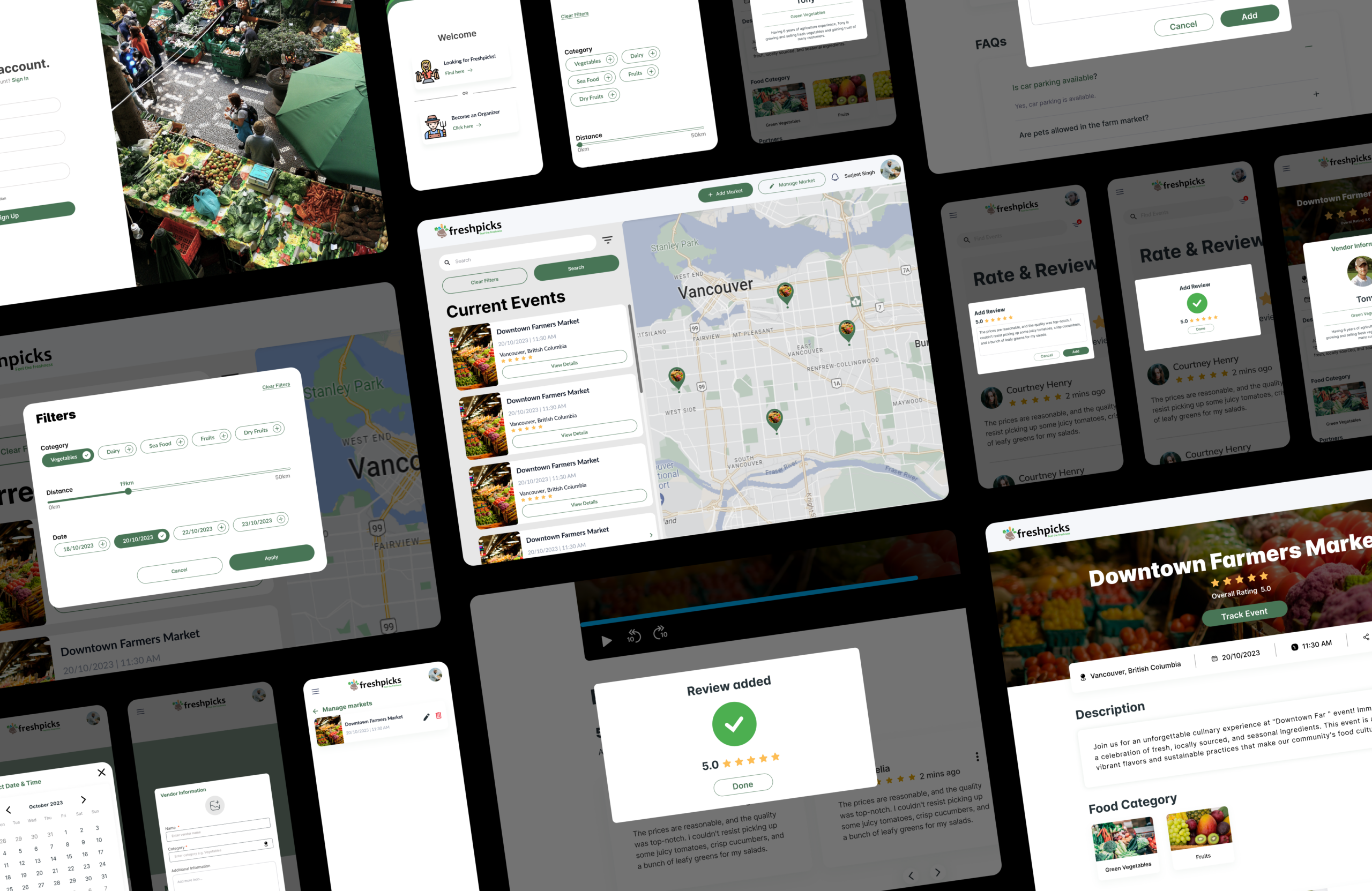
FreshPicks is an online platform designed to bridge the gap between local farmers and consumers, making it easier for people to discover and support farmers’ markets. The platform allows farmers to create and promote market events, while consumers can find local markets, filter by food category, distance, and date, and leave ratings and reviews to help others find trustworthy vendors.
Team
- 4 Designers
- 3 Developers
Duration
- 12 Weeks
My Role
- Design Lead
- UI/UX Designer
PROBLEM
The problem we aimed to solve was the difficulty consumers face in finding local farmers’ markets, coupled with a lack of trust in the food they purchase from these markets. Additionally, farmers struggled with promoting their events and reaching a broader audience, limiting their market visibility and growth. These challenges created a gap between consumers seeking fresh, local produce and farmers seeking an effective way to engage with their community.
SOLUTION
FreshPicks provides a seamless online platform that connects local farmers with consumers, making it easier to discover fresh, local produce and promote market events. The platform features user-friendly tools for both consumers and farmers, enhancing visibility and trust within the local food community.
Key Features:
- For Consumers:
- Find Local Markets: Search events by food category, distance, and date, making it easy to discover nearby markets.
- Rate & Review: Leave feedback to help others find the best vendors and markets.
- Interactive Map: View market locations in real-time and navigate easily using Google Maps.
- For Farmers:
- Market Listing & Promotion: Easily create and promote market events to a wider audience, improving market visibility and attendance.
COMPETITOR ANALYSIS
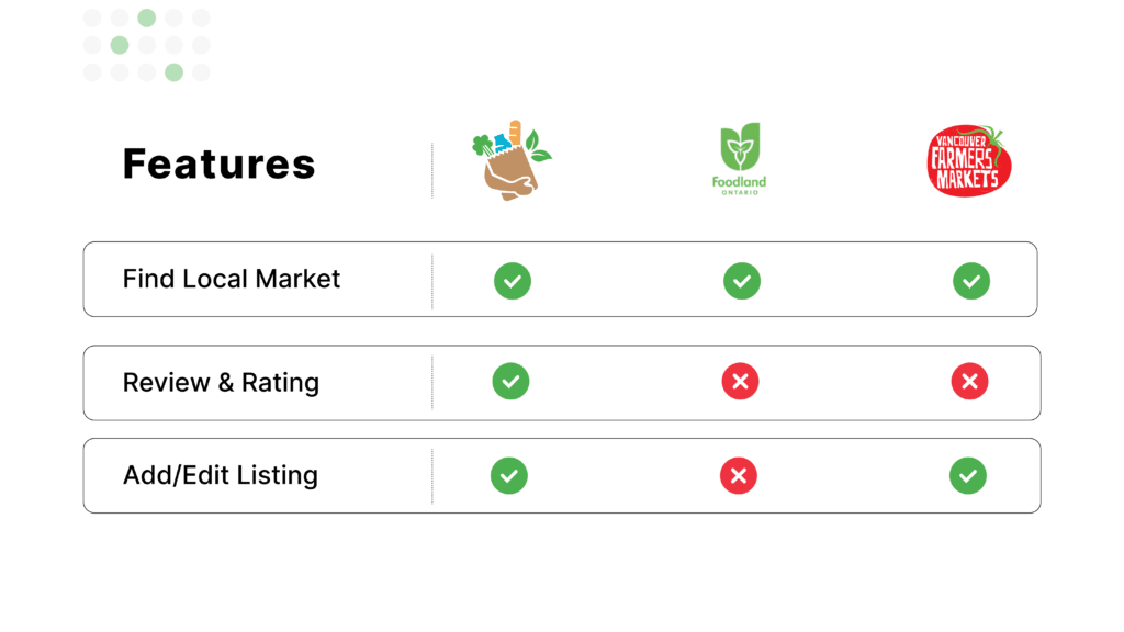
I conducted a competitor analysis of Foodland and Vancouver Farmers Markets, identifying key gaps in their offerings. Both platforms lacked a Rating & Review system, which is a crucial feature for building consumer trust and guiding purchasing decisions. Additionally, Foodland did not offer a Market Listing & Promotion feature, limiting farmers’ ability to showcase and manage their events effectively. These insights helped shape FreshPicks’ unique value proposition.
USER PERSONA & STORIES
02
USER FLOW
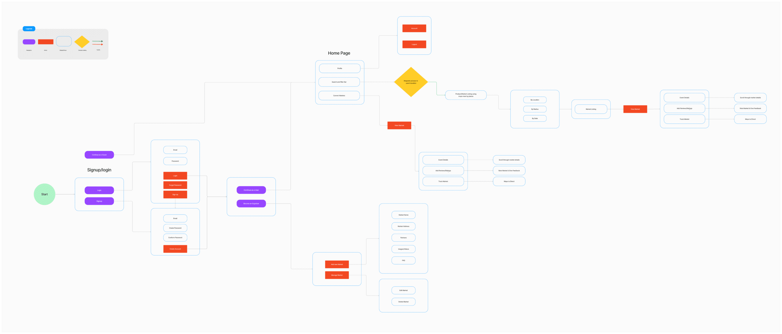
Once the persona was ready, we used it to create user flows, ensuring a smooth and intuitive experience based on their needs and behaviors.
WIREFRAMES
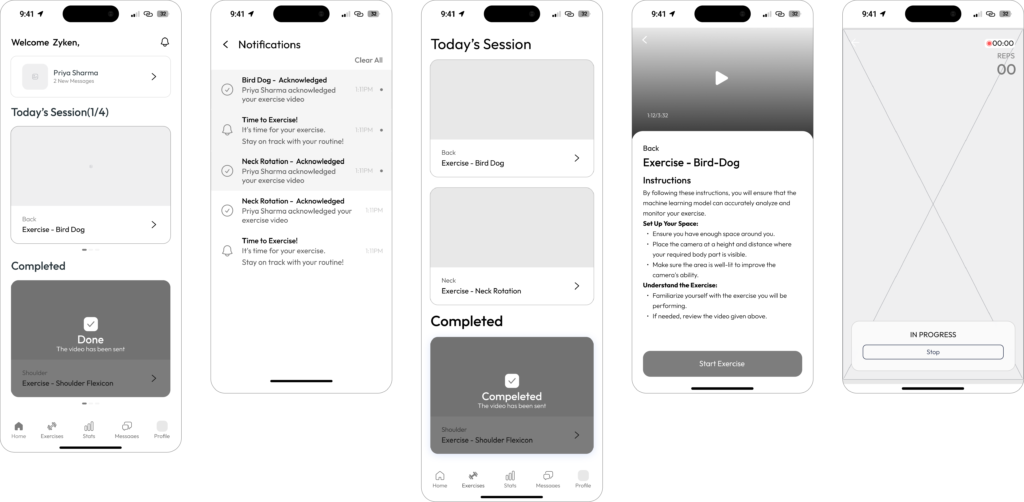
We decided to create wireframes to visually map out the app’s structure, layout, and user navigation flow.
USABILITY TESTING
During the Freshpicks project, we conducted usability testing with three users to identify navigation issues they encountered on the site. This process helped us understand user pain points and areas for improvement in the site’s design and functionality.
BRANDING & UI COMPONENTS
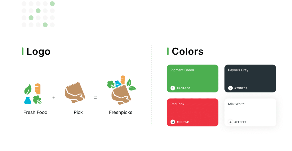
For the Freshpicks logo, I crafted a design that features a bag filled with fresh food, symbolizing the essence of freshness and the convenience of grocery shopping. The bag is clasped by a hand, emphasizing the idea of a seamless, user-friendly experience. Pigment Green was chosen as the primary color to represent freshness, health, and food, creating a strong visual connection to the brand’s purpose.
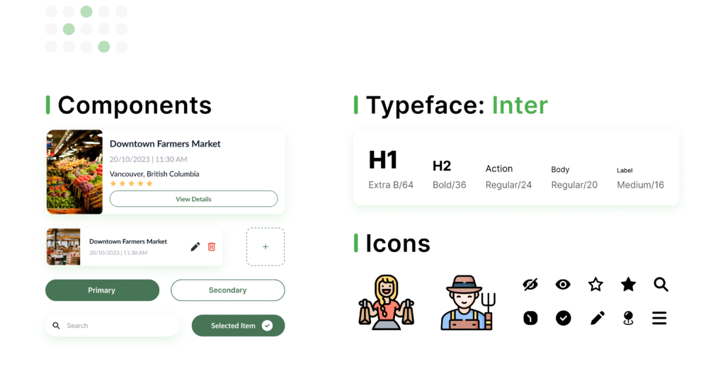
I used the Inter typeface for its modern, clean, and legible qualities, ensuring clarity across all digital platforms. Icons were thoughtfully incorporated into the design to enhance usability and improve visual communication. Various components, such as buttons, navigation menus, and cards, were meticulously designed to maintain consistency and provide a cohesive user experience throughout the project.
MOCKUPS
The survey indicated a preference for digital solutions over manual record-keeping, a strong need for delivery tracking systems, and the importance of analytics tools for understanding customer trends and managing services effectively.
LEARNING & TAKEAWAYS
User Feedback During Waiting Periods
I learned that providing meaningful information during potentially frustrating moments, like video uploads, significantly improves user satisfaction. This reinforces the importance of keeping users engaged and informed throughout all processes, even when the app is performing background tasks.
Clarity in UI Elements
The confusion around icon functionality highlighted the need for clear, unambiguous UI elements. I found that while minimalist design can be aesthetically pleasing, it shouldn’t come at the cost of user understanding. Balancing visual simplicity with clear labeling or tooltips is crucial for intuitive navigation.
UX Design Extends Beyond the Screen
When users struggled to keep track of their reps away from their phones, it hit us – good UX isn’t just about what’s on the screen. We realized we needed to think about how people actually use the app in real life, not just in perfect conditions. This led us to explore options like voice feedback, showing that sometimes the best solution isn’t visual at all. It was a wake-up call to design for the messy, unpredictable ways people might use our app, and to be flexible in how we deliver a smooth experience, whether they’re looking at the screen or not.